I have seen many business cards in my life. I think it is one of those items for exchange that – if done right – is a fundamental happening for a future collaboration between two individuals. But that also means that it has to be a good business card – otherwise you might as well have given them a piece of paper writing your number on it. Here is my 10 best business card advices:
- Order the amount that you are actually going to need
It depends on your field of course – but sometimes, you don’t need 2000 business cards. There are two ways to approach this: Either you play the networking game and have a conversation with people at first. Then trigger their interest and have them ask for your business card, or – spread out as crazy and flick them at every person you meet – depending on your type of business of course. - The paper is probably 80% of the design
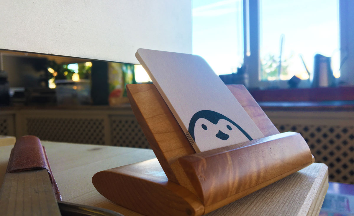
Use quality paper – at least 300 gr. Make it a card the feels good in the hand, not something that feels cheap or seems like it can be folded easily. If you are really fancy, go after something a little more different. I personally use 100% cotton cards by Moo, because I really love the texture, thickness and feel to it.. And it is much more different from anything else. - Use fonts and colours properly
I see too many business cards trying to compensate for the paper quality by making burning red cards with ornaments and dolphin pictures along with a name written in huge thin letters and a phone number written in like 4pt in the corner. Nothing wrong in dolphins nor red cards, but hire a designer to make it look right – otherwise it is just a failure. - Follow a brand identity
Referring to above again, it may be useful to have a good identity guideline for your brand to help you keep consistency in your print collateral. Understand how to use colours sparingly and correctly and making sure the same typeface along with size are used the same across all your material. - STOP THOSE F******* SOCIAL MEDIA ICONS!
You heard me... Nobody taps on your business card and expects to be taken to your Facebook page anyway. If Facebook is your only online gateway for people to access your products and services (a reason for you to probably get a website) I suggest you write the Facebook address out completely on the card. Don’t just throw in a Twitter icon and Facebook icon. They are at no use on your business card. Besides… People expect you to be on social media, so they will find you.. Trust me…….
- KISS (Keep It Simple, Stupid) Design - Don’t write too much
I like a card that gets to the point and don’t clutter up a lot of details. I need your name, your email address, phone number and possibly an address. Then your logo and a brief description of what you do (No more than 10 words). That’s it! No need to write every single service in bullet points nor write every possible web address to visit. Just tell me how to get in touch with you. That’s all. - Get a good email address
You will be surprised how many cards I see with long and tedious email addresses that firstly don’t fit properly on the card, but also takes me forever to write when I have to send and email. [email protected] is not a good email address. And neither is [email protected]. If you have your own domain that you use for your website, please create an email address on that: [email protected]. - DO NOT PUT A PICTURE OF YOURSELF ON YOUR CARD
Unless you are a Long Island Real Estate Agent or Bradley Cooper, there is no need to prettify your card with mugshots of yourself. There is no need to make people remember how you look like – cause they will if you have made a proper impression. Otherwise you just look like a creepy intruder in the wallet’s family album. - Remember the logo – but don’t overdo it
Make sure your card’s design supports the positioning of the logo and that the logo sits seamlessly with the rest of the content. It can be fun to have the logo as one big graphic on the back of the card, but be sure to keep space for all the essential data before getting too creative with supporting graphics. - Stick to the standard measurements
Sometimes it can seem fun to have like a round card or a completely square card. Something different – and I am actually a huge fan of those ideas that breaks the norms and makes people remember the cards, but I would also consider them bore of a flyer or contact-tag or something. Business cards should be kept to the standard measurements as your receiver may carry it in his wallet or has an organiser for business cards at his office. If your card doesn’t fit – it won’t get a spot.
I hope these tips can help you next time you get a new business card design. Of course – many of these are my own personal opinion and shouldn’t be forced upon you in any way, but maybe a few of them could be helpful for you. Then I will look forward to receive your card next time.